During the course at Awari, I had the opportunity to develop a project going through the many stages of UX and UI to get to the final prototype. I am thankful for my teacher Gabriela Sousa, and my mentor Luis Arratia who guided me in this process. Their knowledge and support allowed me to learn and finish this project!
In order to apply the knowledge acquired during the course, I chose to create an app aimed at pet parents and caretakers. I separated this case study into four main sections following the double diamond concept: discover; define; develop; deliver. As a quick note, I translated only some of the contents of this project to English as it was in Portuguese.


Overview
The Project Brief: In order to apply the knowledge acquired during the course, I chose to create an app aimed at pet parents and caretakers to help them track the routine of their pets.
The Problem: The problem appeared through a conversation with some family members who own pets. During that time, one person asked the other partner if he had given their pet the medicine, what time the pet had eaten or if he had forgotten to clean the dog's mouth. This situation led to stress and discussions between partners about the daily tasks regarding their pets.
The Goal: Create an app, based on user research, to help pet parents and caretakers organize all tasks related to the pets' routine with the possibility to share the information and/or calendar between them.
User Research Plan
The research plan helped me organize what I had to do within my timeframe and schedule. Besides, I was able to choose the best tools to explore what the potential users think or need. This was an important starting point of the project.
The Objective
The purpose of this research was to explore and understand pet owners' pain points regarding the organization of their pets' routine and other related tasks. In addition, to better understand the user's profile, it was essential to also:
- Assess whether caretakers should be part of this group or if it would be a separate audience with other problems/objectives to be solved.
- Understand if the problem really exists.
- Understand and identify the tools within the app that would help solve the possible problem.
- Identify other problems in the target audience's routine that could also be solved.
The Chosen Methods
Desk Research: it aims to find the importance of the routine for pets and understand the users a little more. This same research was used to build the CSD matrix at Miro.
Online Survey: important to have an overview of the audience profile, of the pains related to routine organization and pet tasks, and possible insights of what they consider to be important.
Virtual interviews: this survey provides a deeper understanding of the users' views on the difficulties they face in relation to pet routine organization. Furthermore, it is a method that I can use to create the personas and empathy maps for the project.

Research Analysis
During the desk research, it was possible to notice some interesting facts about the pet's routine and get an overview of the user profile. This research also helped build the CSD Matrix (image below) and use the hypotheses to build a script for the survey and the interview.
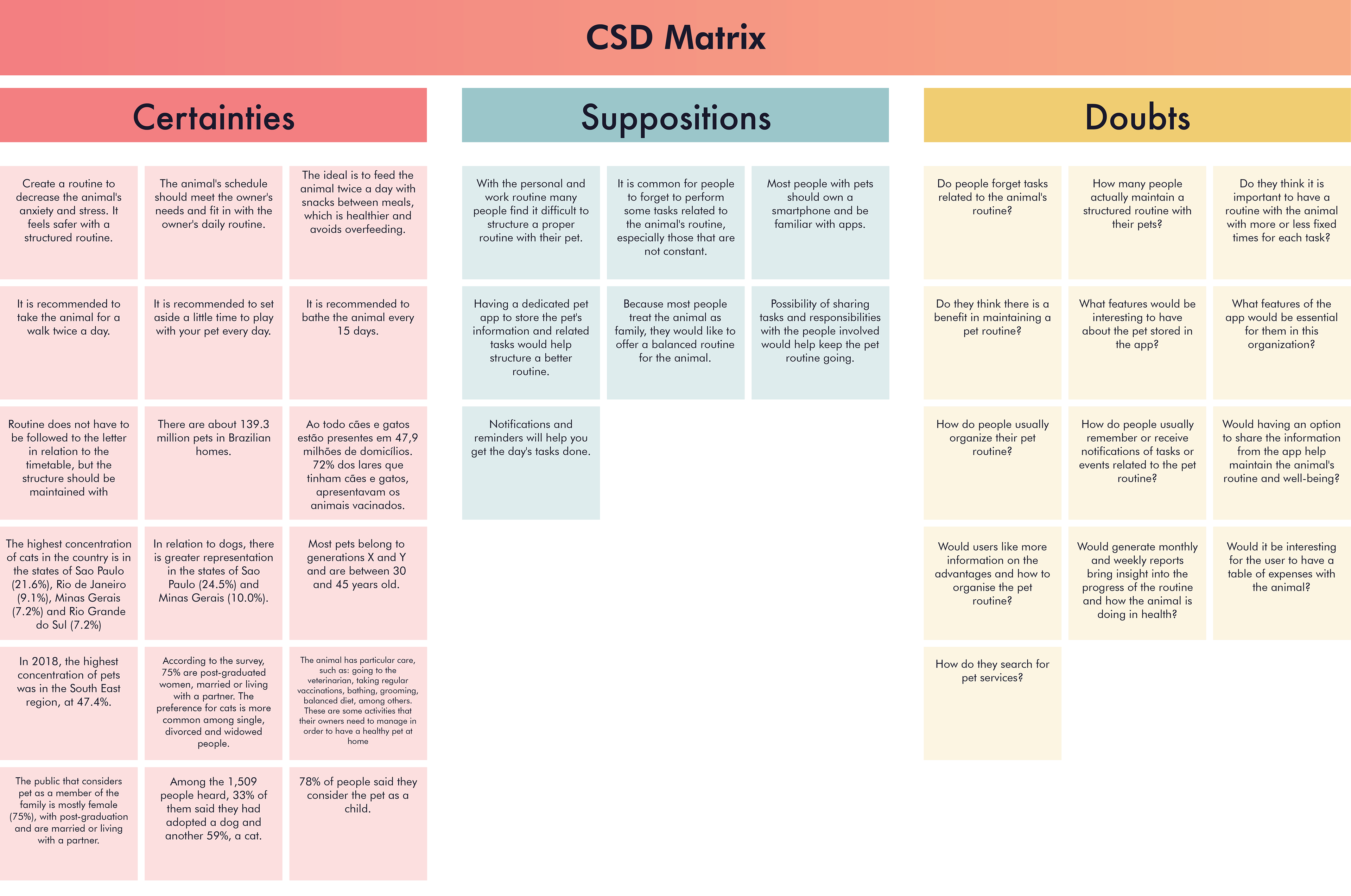
Click on the image to increase.
The online survey had 114 respondents (not many, but for the study purposes, it was worth the experience 👍 ), and the virtual interview had seven interviewees. Some of the relevant data collected in the survey are in the image below.
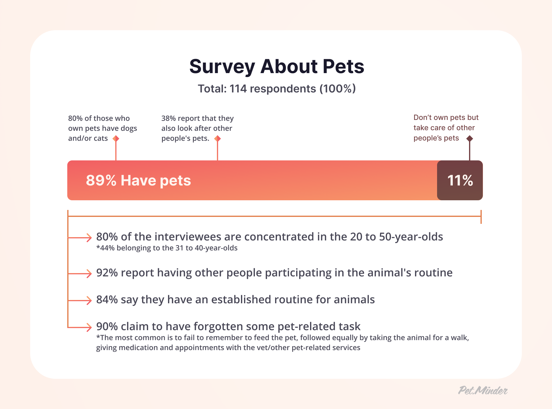
Click on the image to increase.
Regarding the virtual interviews, the most relevant point for pet owners was to remember vaccines, appointments and pet medication. 6 of 7 interviewees stated that it would be good to have the pet's profile and health-related records to share this information in some medical emergencies.
📘 "Weight records, vaccinations and medical things are the most important because the chances of forgetting are high."
📑 "I think it would be good to have an emergency file with information about allergies, previous allergic reactions, appointment history, what he can or cannot take, the contact details of the vet who usually takes him to the vet, and others."
Based on the data collected in the surveys and interviews, it was possible to notice which features are more attractive and functional. A point of great relevance in the interviews was about the daycare/hotel monitoring and information of the animal. All interviewees mentioned that they would like to communicate with the daycare/ hotel and receive updates about their animals through the mobile phone. 4 of 7 interviewees also stated that it would be interesting to have a way of accessing the pet's routine in the daycare/hotel through an app or website.
⚠️ "I would like to have information on the whole routine... Not only about food, medication, but also behavioural."
📲 "I would like to receive the information directly on my mobile phone, have maybe an app integrated with the hotel and the daycare with all the information of my dogs there to know if the tasks related to it have been carried out."
Research Final Notes
Through the analysis, I could notice similar information in my desk research, the survey and virtual interviews. It was also interesting to get a new pain point from the interviews, which I will need to consider the daycare/hotel in the app. Many of the interviewees needed a better way to communicate or access information from daycare/hotel services. The age range of the interviewees is relevant to creating an intuitive and friendly interface for everyone.
After this research, I also realized that I would need to have a dedicated user research plan for caretakers as they would fit with the daycare/hotel. So due to my time limit and schedule, this will be for future studies. At the moment, I will only focus on pet owners. 😗
Personas & Empathy Maps
Based on the interviews with users and the data collected previously, I was going to create four personas. However, one of them was a person who doesn't own pets but helps take care of other people's from time to time. So, after some meetings with my mentor, I could understand that this profile had a high probability of not being a user. And, in the end, I created three personas.
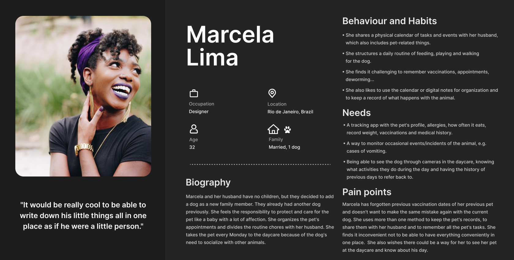
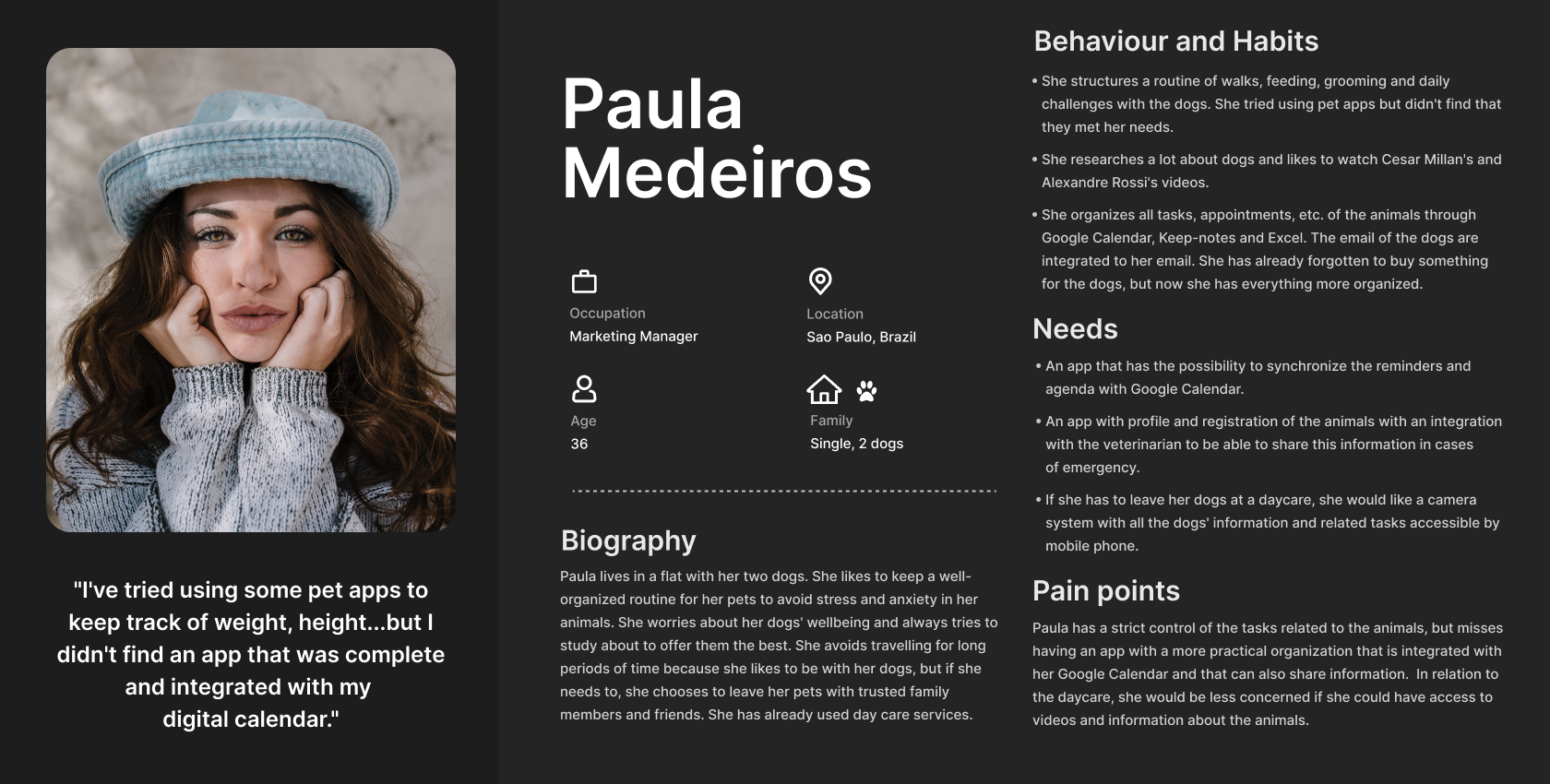
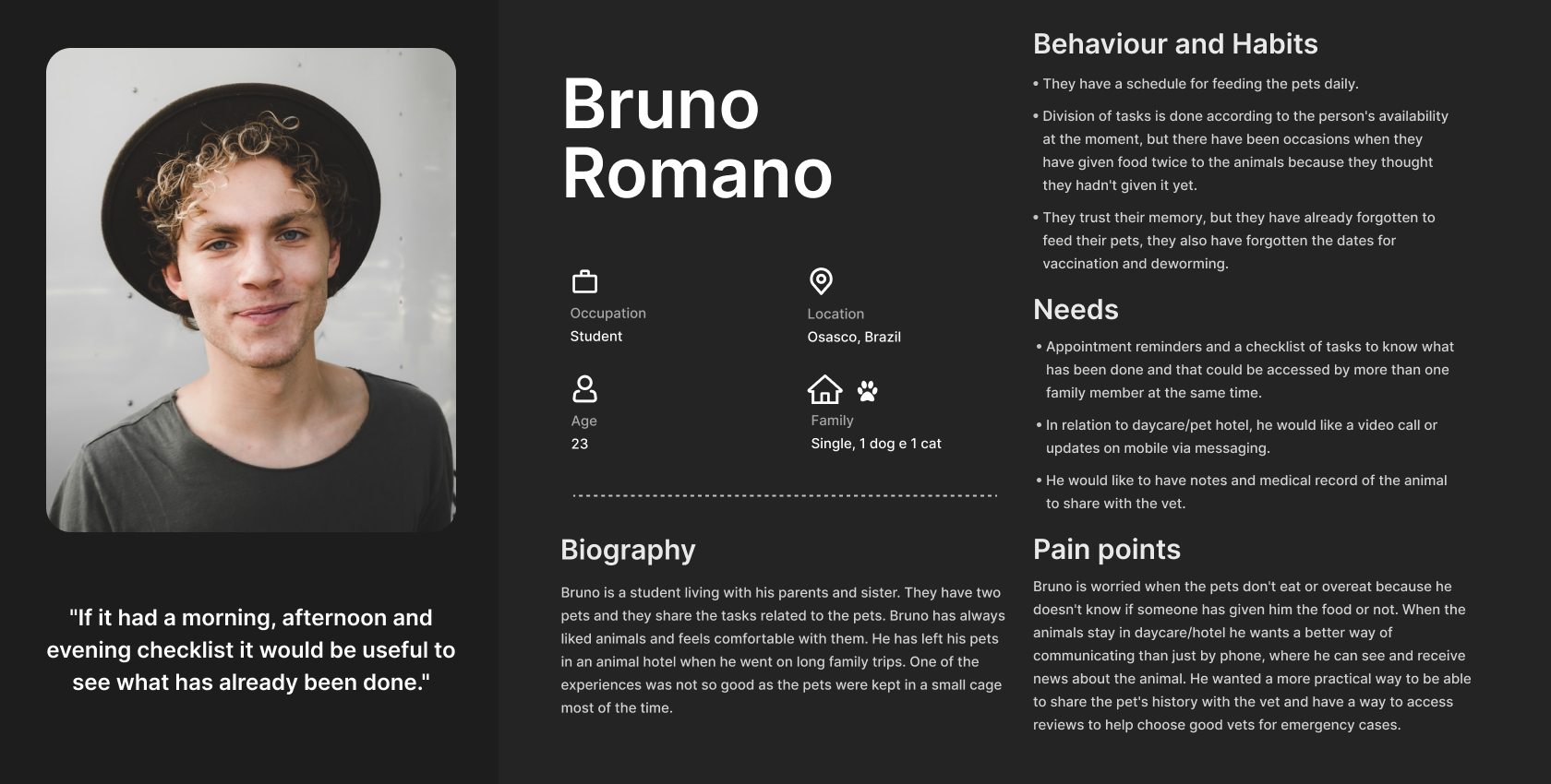
In addition to personas, I also created empathy maps to practice and deepen the understanding of users. You can check the empathy maps below.
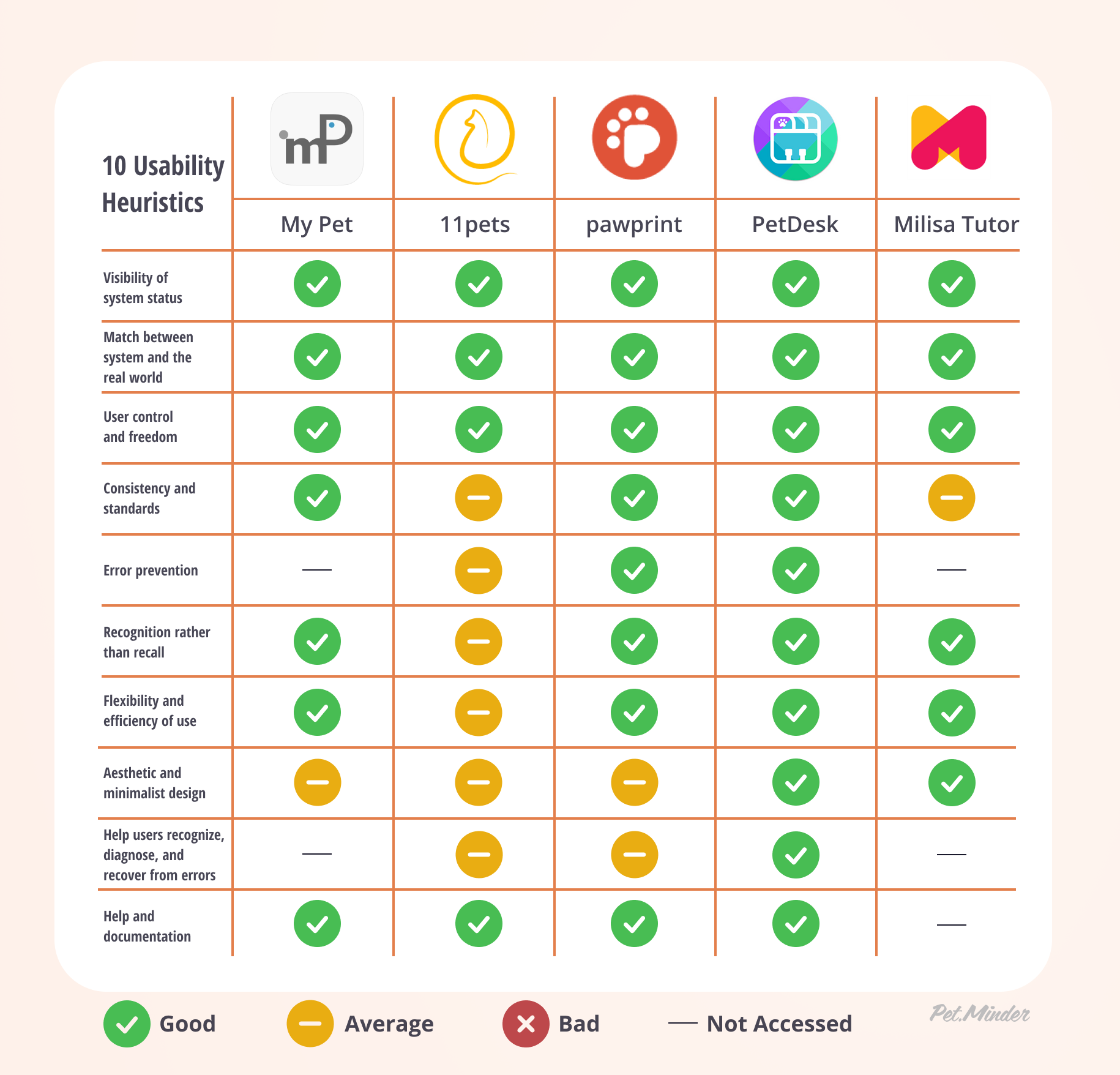
Benchmarking
Through this analysis, I could understand that the more features an app have, the more difficult it will be to have an intuitive app. MyPet, Pawprint and 11Pets have so many features that confuse the user, which the person ends up taking more time to get used to everything. An interesting point to be considered is that 11Pets can customize the features presented according to the user's needs, which shows to be advantageous in an application with many features in which the user may not use all of them. Pawprint has an easy way to add other users through email. Among all the apps, PetDesk is the one with the most positive reviews. It is a straightforward app, and its direct journey makes it very easy to use. Besides, its interface is much more intuitive, simple and inviting to users.
Milisa, a software developed for pet daycare has integration with a mobile app developed by them. The app has a simple interface to inform the customers about the main activities performed during the day. Some interesting points to add are the possibility to see photos or videos of the animals in the daycare, and any additional notes regarding the pet's health. The daycare software warns the period of revaccination of the animals, and they also use this to remind the owners.
Job Stories
With all the information collected, I started to write down the job stories (image below). These are also important to keep in mind the needs, concerns and motivations of the users. These will be very helpful to keep the clarity and structure of the small doable tasks when I start to think about the next step.
Final Notes
I think the research phase the most challenging part because it was my first time interviewing people. I was scared about not gathering enough information I needed, but I noticed that the more you practice, the better you get at it. It was a great experience and learning process where I got to learn a lot. I am happy with the results so far.
After I had all the information from my research analysis, personas, benchmark, and job stories, I was ready to put my hands into the work considering all the previous steps.

User Flow
Thinking about an app for mobile phones, I started to work on the user flow, where I had to consider how the user would accomplish the tasks and the path they would take. I also thought about where the features would be located and organized.
There was a lot of back and forth on this step, and I received a lot of good feedback from my mentor. Below, you can see an image of the final user flow of this project.
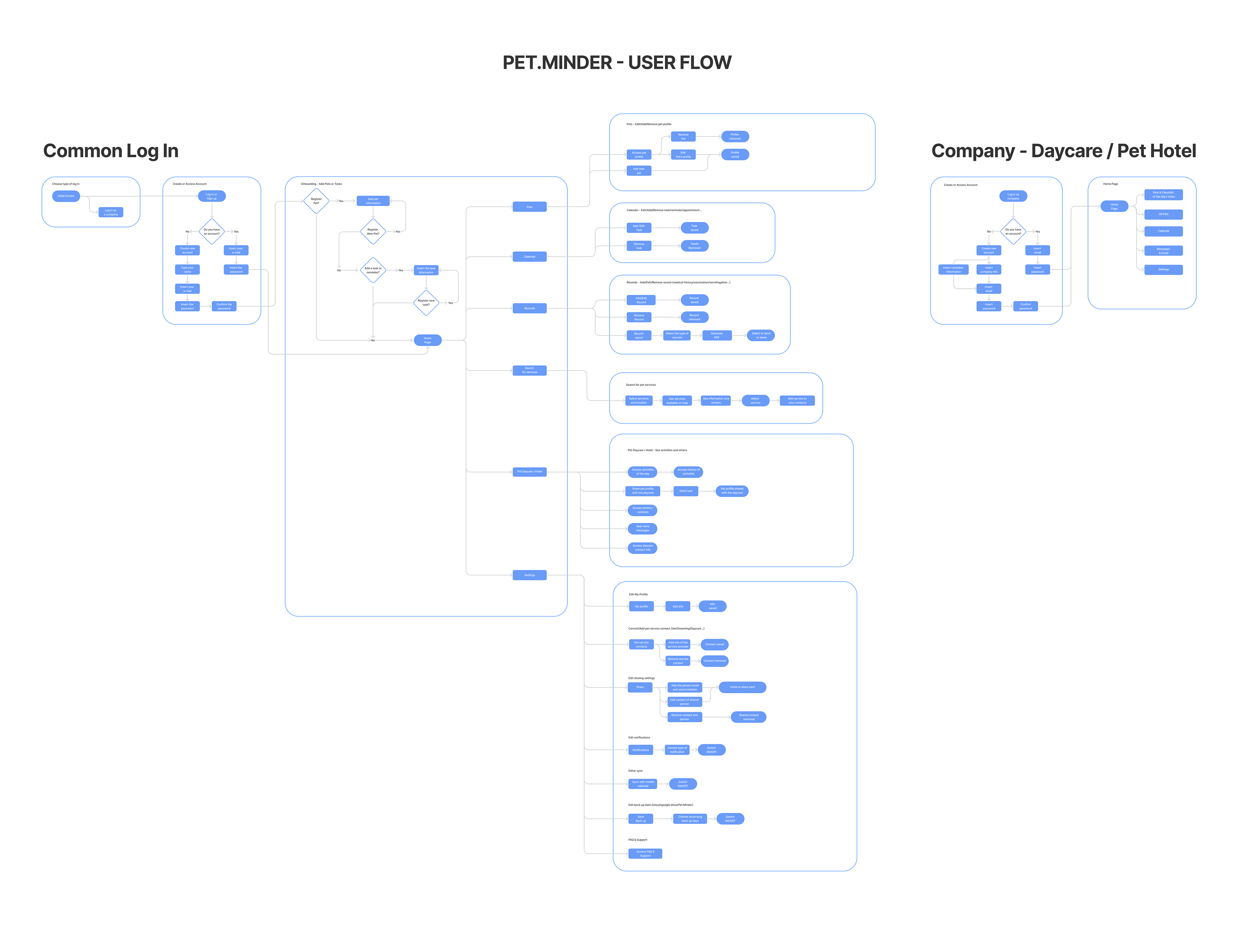
Click on the image to increase.
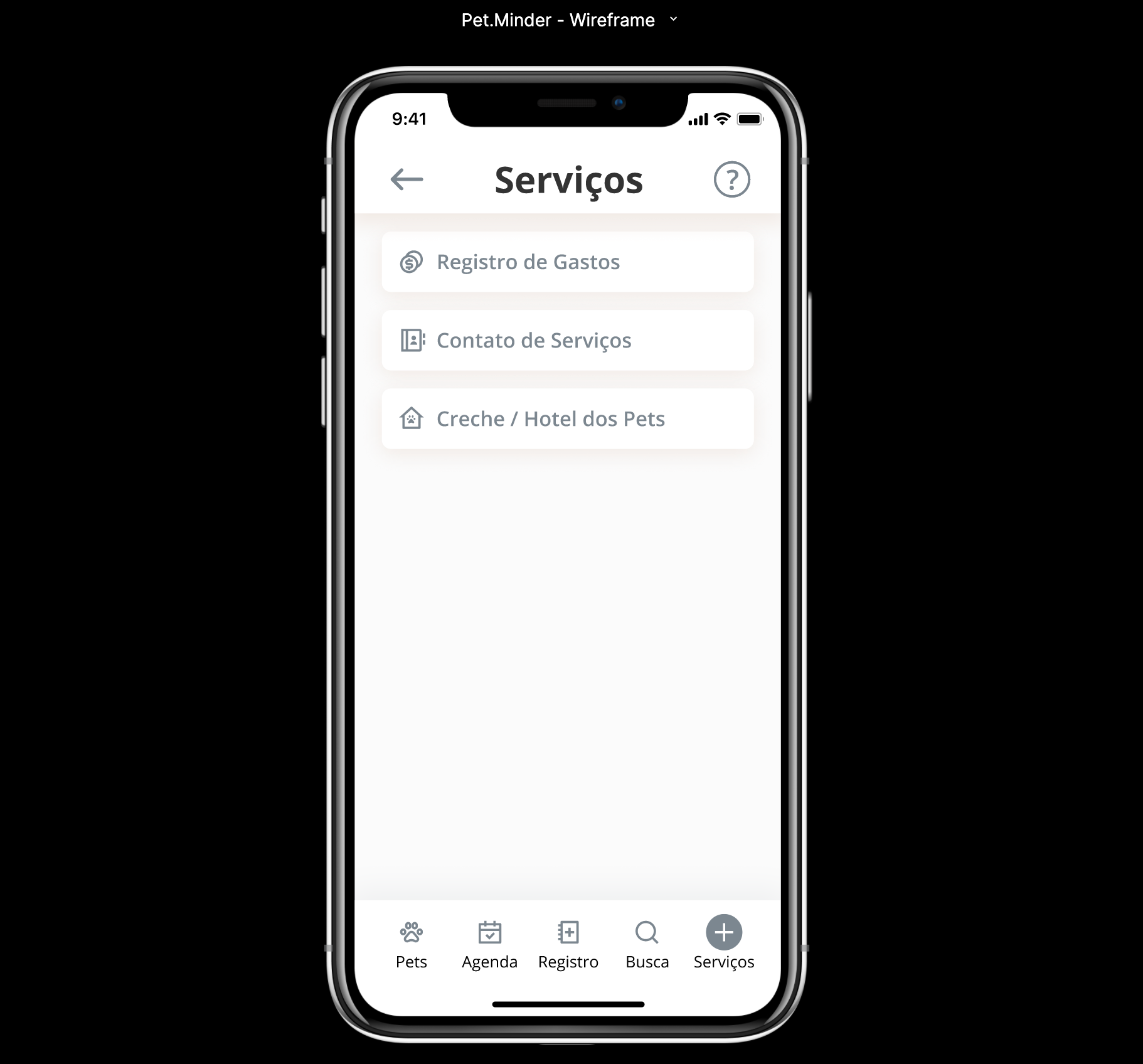
Wireframes
In my first wireframe for this project, I tried to have the onboarding and main screens to see the organization. However, my onboarding was too long, and I had to narrow it down, so it wouldn't be so tiring for the user. There were also some concerns regarding the location and grouping of some features. After a few adjustments, my mentor and I agreed that it would be a better option to make a simple prototype to make a usability test in order to collect more information regarding this app and see how the users would feel.
Below, you can view the wireframe.
Usability Test
For the usability test, my mentor and I discussed two interesting methods to use for this study:
Interview: to have a deeper insight, see in real-time how the users face each task and what they are thinking. After each interview, I also made a questionnaire based on the ten questions of the System Usability Scale (SUS).
Maze: an online platform for user testing that will be interesting to learn how it works and also be able to have more users to do the test. After each test, I added a link to a google form with the SUS questions.
Usability Test Analysis
I interviewed four people to do the usability test with a similar profile as the personas created earlier. In general, all the interviews went smoothly, and they all provided amazing feedback regarding the app and test. The SUS average score for the interview usability test was 87,5 which is a good score with room for improvement (the average SUS score is 68). If the score is under 68, then there are probably serious problems with the usability of your website or app.
One of the main points that they found weird was the 'Share' feature inside the animal profile. All of the interviewees went straight to the 'Settings', and they thought it to be intuitive to go to this place. I agreed with their point of view as it was too hidden for them to find. Besides this, another challenge they had was to find the daycare feature with the daily activities. All of them also thought that they would be able to find it inside the 'Agenda' as they didn't know where to go to find the daycare.
Below, you can check some of the screens that users had some difficulties with:

Pet Profile with the Share, Tracking and Medical History features
Services tab with the button to access the Daycare
Some other insights and feedback I could get from the interviewees:
- Have the 'Share' icon more exposed, visible or inside settings
- Inside 'Agenda', click on the date and open a pop up with the activities marked on the day.
- Start the 'Records' screen with the options to make a new registration.
- Change the 'Services' tab to 'Daycare'.
- Have the same daycare/hotel screen for potential caregivers (same features)
- When adding a task, the notification could have other options like days and hours, not just minutes.
- Add the name of the person who added the task, registration, etc. (for better control of who did what)
- In the services search tab, have the rating or amount of reviews when it shows the options (easier for the person to choose based on positive reviews)
Maze Usability Test Analysis
Unfortunately, my experience with the free version of Maze was a bit biased due to some challenges the users faced when using the platform. I had 18 testers, but only 12 were able to go to the end of the test. Some people tried to do it on their mobile phones, but the prototype didn't fit the screen, and they couldn't do the test. Other people had difficulties with English, the use of the mouse to interact with the prototype, and the fact that the prototype had only some of the features working.
The average SUS score was 72,7 (considering the answers of the 12 testers who finished the test). Their feedback was pretty similar to the interviewees, and it was possible to see where they struggled and the path they took for each task.
Although I had some problems with Maze, I think it was a good way to learn a new tool and understand their analysis. I will probably try it again for usability tests.
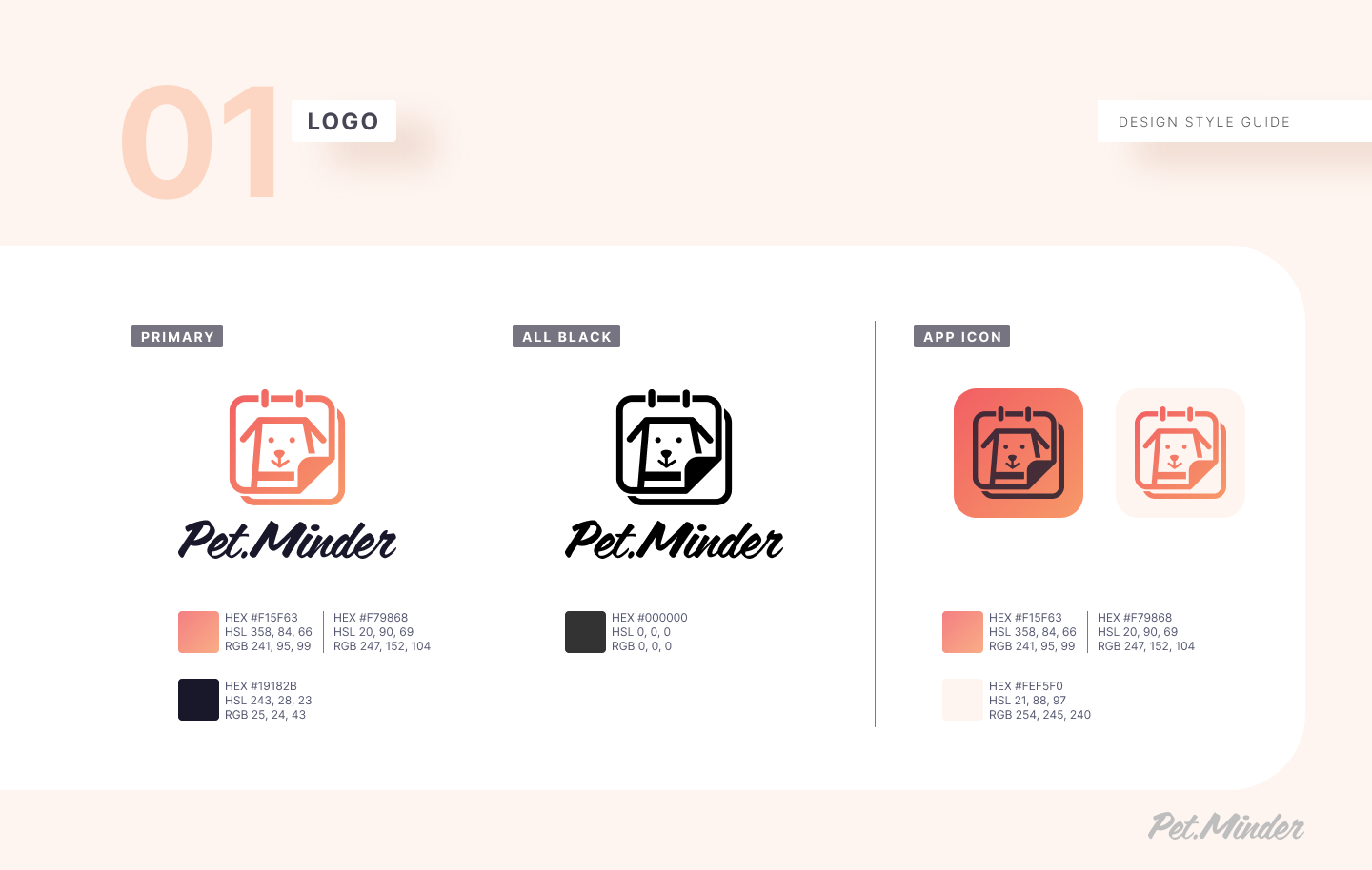
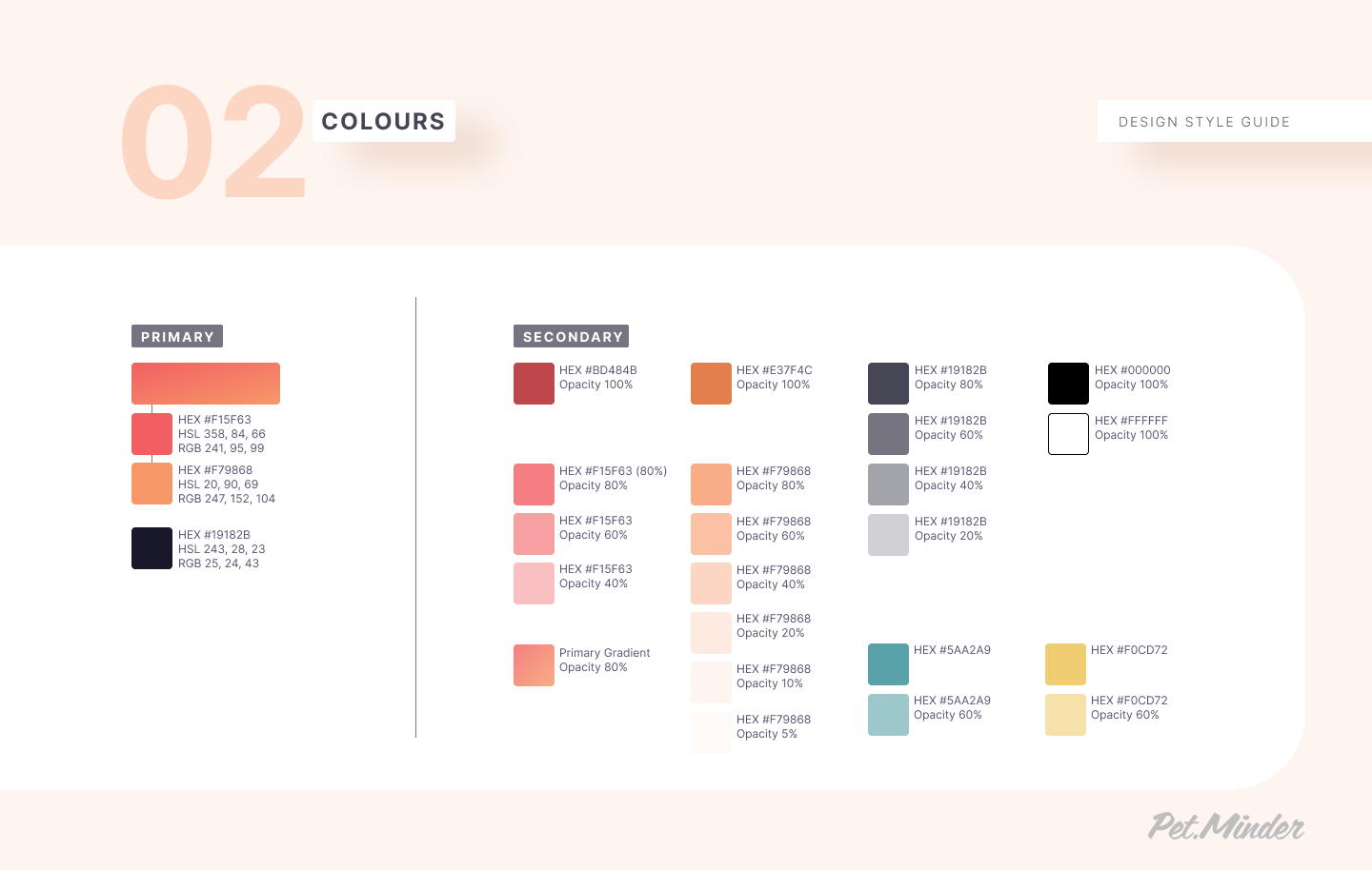
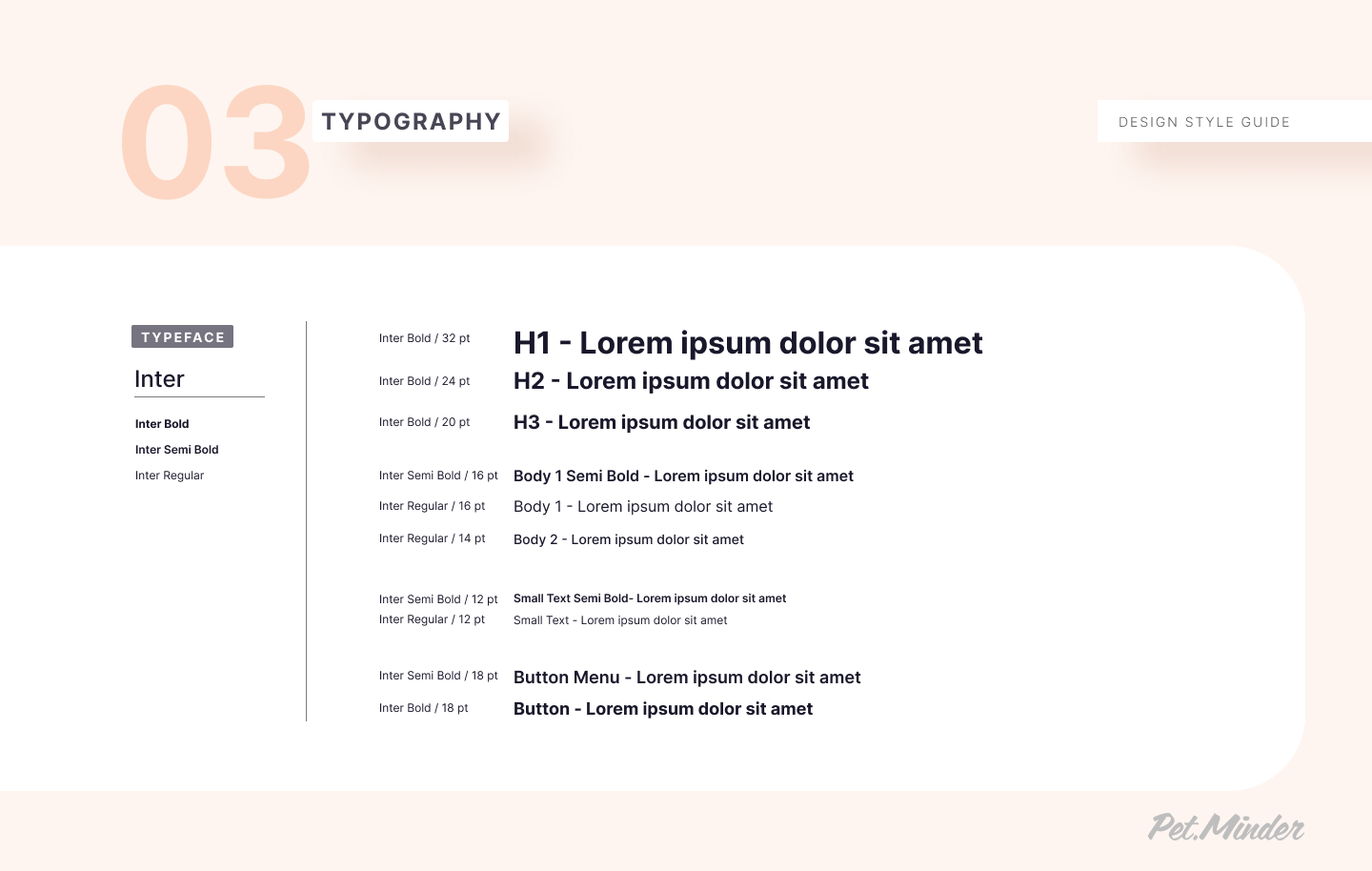
Style Guide
I had a lot of freedom to decide the colours and font for this project. I created a simple logo that could look inviting and warm to other people.

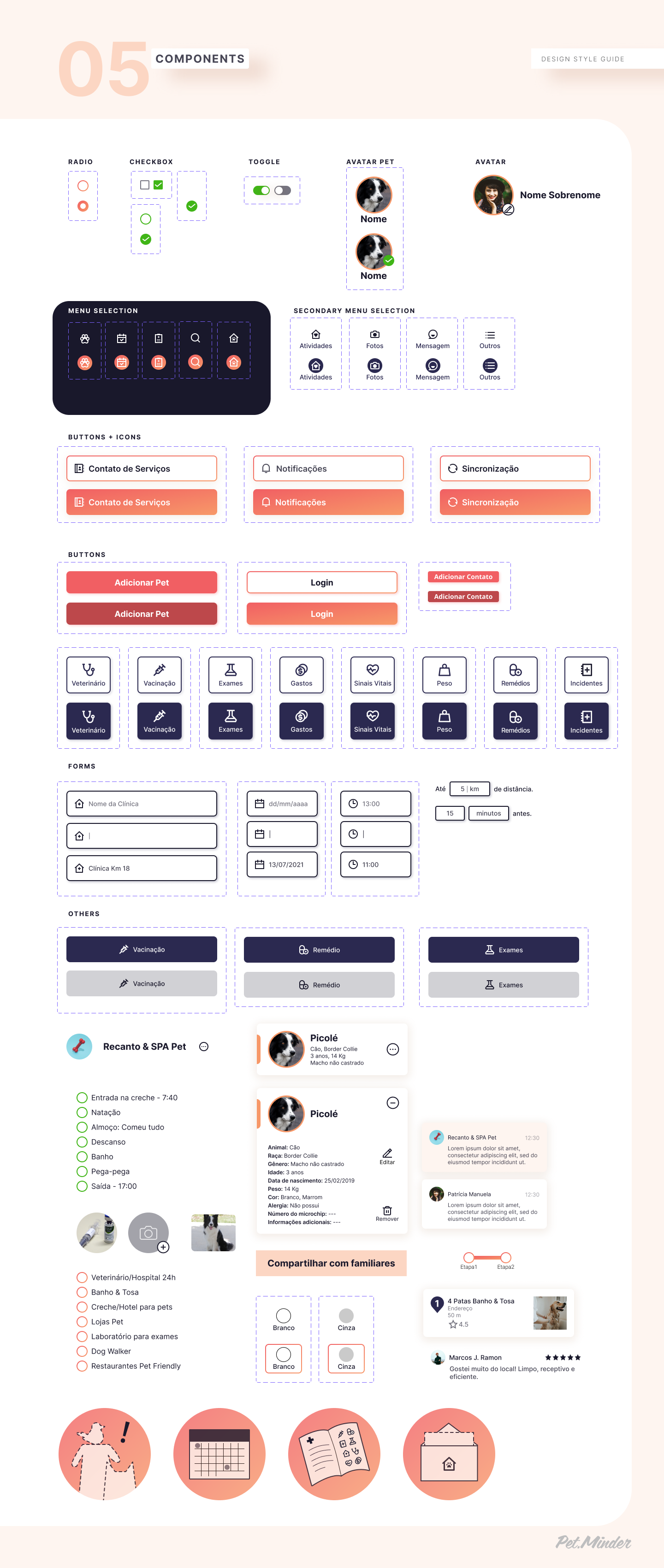

Final Prototype
Based on the usability test analysis, the final user flow, and the style guide, I made the adjustments to the screens and made the final prototype. ❣️

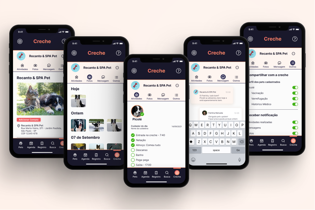
Prototype Screens
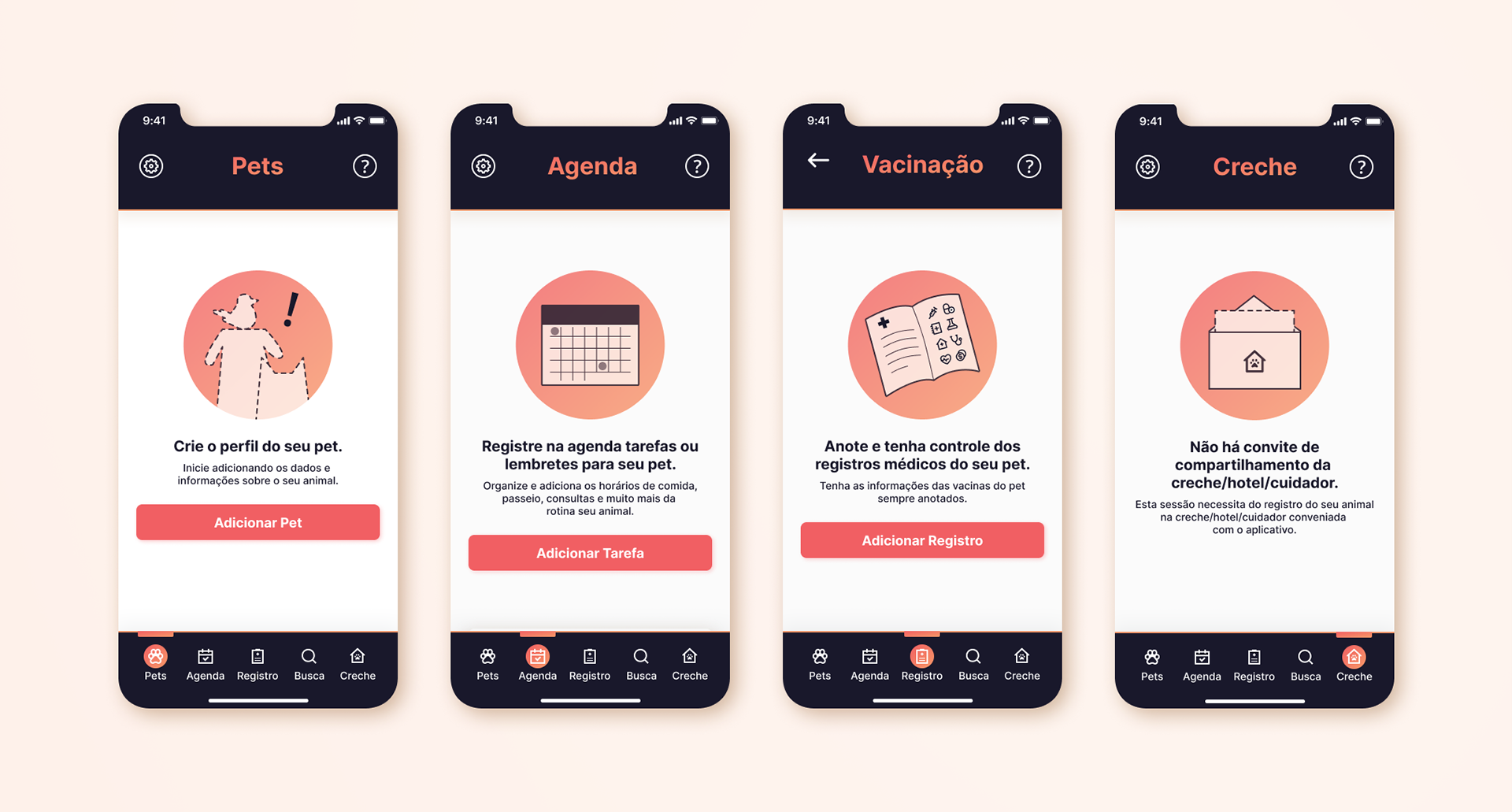
Main Empty States
Project Learnings
Pet.Minder was my first project from the start to the final prototype. It was an incredible journey in which I was able to learn a lot and experience many things that I was not able to in previous projects. Here are some of the things I learned:
- Making a research plan, CSD Matrix and survey questionnaire.
- Writing an interview script, doing interviews with real users (video calls due to COVID), and analysing the research data. 👍
- Using the research data to create personas, empathy maps, job stories and benchmarking to help define the user problems and think about the possible solutions.
- Practicing UI using Figma to develop the user flow, style guide and app prototype considering the accessibility and grid system.
- Doing usability tests with users to understand what needs improvement, what does not work and what does.
- Refining the final prototype considering the usability testers feedback.
- Having a nice back and forth conversation/questioning with my mentor to better understand the process and how to improve (Luis Arratia, thank you so much for the patience!!).😆
This project turned to have more doors than expected as I could do a new research focusing only on the daycare/hotel/caretakers to develop a proper website platform and app prototype. It is a nice opportunity, and I might do it in the near future. ☺️